view Rolex Submariner
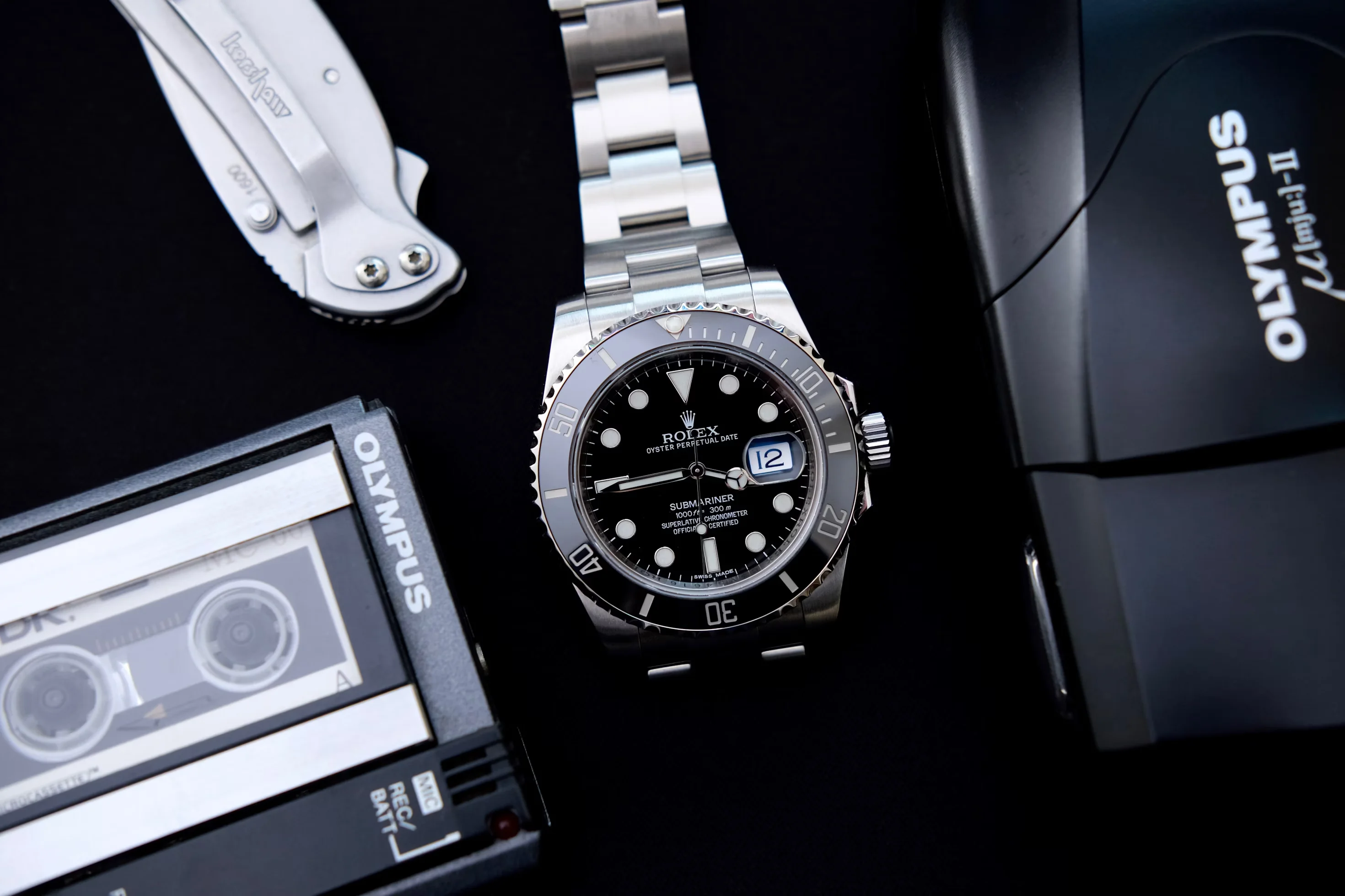
Rolex Submariner
The Submariner nails the hardest brief in product design: make a purpose-built tool so clear, sturdy, and honest it becomes a daily uniform. Its value is discipline, not novelty—legibility at a glance, a bezel you can trust, proportions that disappear on the wrist. It made “do-everything” look effortless, which is why so many brands have chased its silhouette for seventy years. We prefer the no‑date for its clean symmetry, but the point holds across the family: the Sub balances function and restraint with unusual maturity. The Glidelock clasp actually fits in real life, the Triplock crown feels like a tiny vault, and the bezel’s click tracks time with calm precision. This is the baseline—how modern dive watches, and many everyday watches, get measured. In 1953, guided by René‑Paul Jeanneret’s use‑case thinking and enabled by Rolex’s Oyster case and Perpetual rotor, the Submariner arrived as a watch designed to live underwater, not just survive it. Early references 6204/6205 set the grammar: high‑contrast dial, luminous markers, and a rotating timing bezel. The “Big Crown” 6538 pushed capability; the 5512/5513 era added crown guards and settled the proportions; the 1680 introduced a date; the 16800 brought sapphire crystal, 300 m depth rating, and modern reliability. The 21st century added ceramic bezels, solid bracelets, and on‑the‑fly micro‑adjustment—changes that made the platform tougher and easier to wear. Through all of it, the idea never drifted: readability, robustness, and incremental improvement. Materials shifted from acrylic and aluminum to sapphire and ceramic, but the watch remained the same kind of object—quietly better, year after year. Few objects move so easily between salt water and the spotlight. Sean Connery’s Bond wore a Submariner and defined a visual shorthand for capability without swagger; later Bonds kept the thread. British military‑issue Subs did the work for real, which gave the movie versions credibility. On land, the watch slipped under cuffs in newsrooms and boardrooms. Robert Redford wore one while reshaping the image of the American leading man; architects and artists adopted it as a quiet commitment to clarity and durability. Today the Submariner is likely the world’s most recognized serious watch. Its ubiquity doesn’t cheapen it; it proves the cultural point. The Sub works as a passport across worlds because it never tried to be anything but a perfected tool. That’s why it remains the reference: a design so right it disappears until you need it—then it’s the only thing that matters.
watches
automatic
dive-watch
steel
swiss
rotating-bezel
view Omega Speedmaster Professional "Moonwatch"
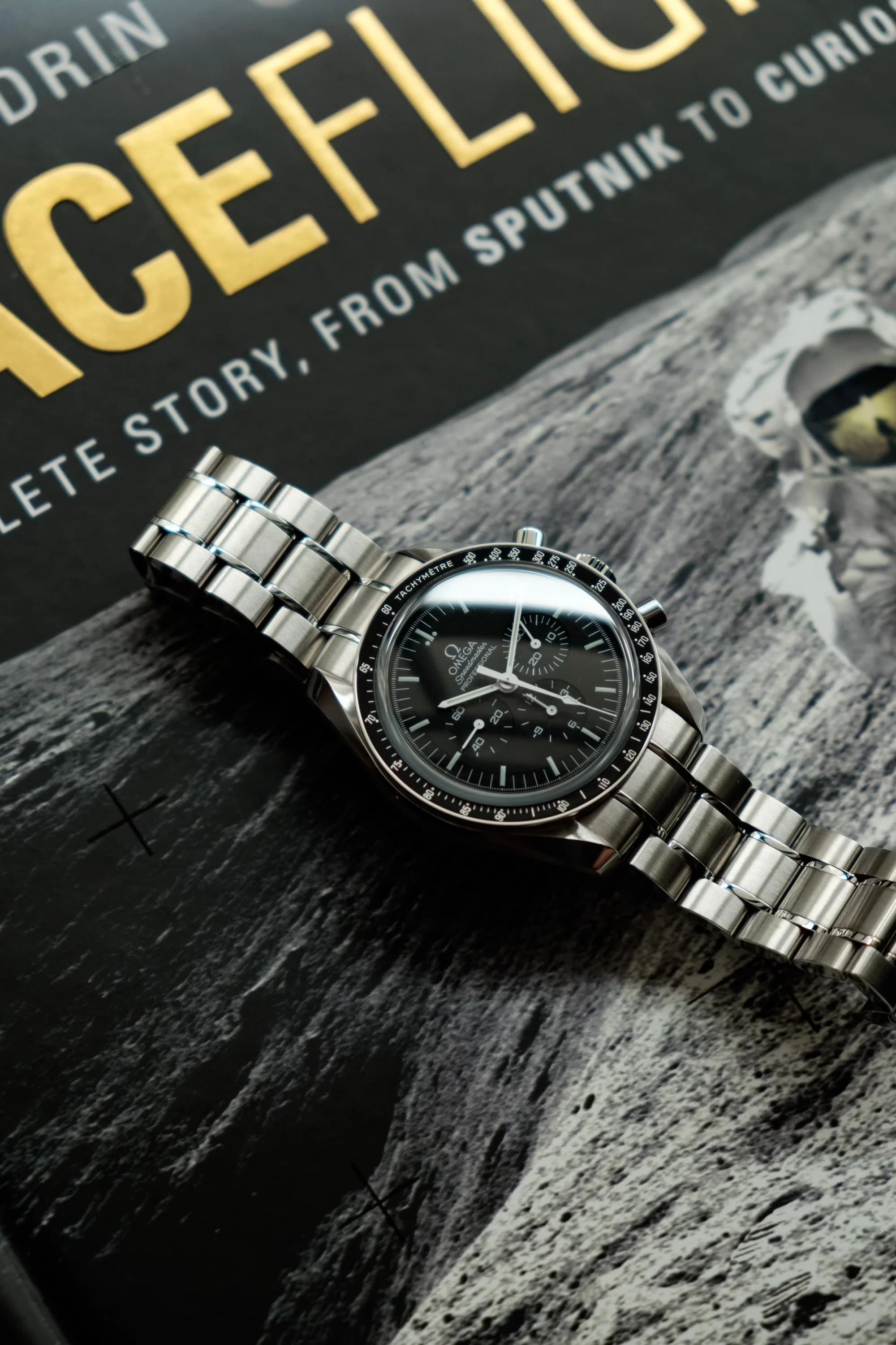
Omega Speedmaster Professional "Moonwatch"
In our view, the Speedmaster Professional Moonwatch is the clearest expression of a purpose-built chronograph. Everything you need is here; almost nothing you don’t. The dial is built for legibility: high contrast, balanced sub‑registers, a minute track you can actually use, and typography that reads at a glance when it counts. The external tachymeter isn’t decoration; it’s the point, which is why Omega put it on the bezel and kept the dial clean. The asymmetrical case wears slimmer than the myth, and the pump pushers have a crisp, positive click. Manual wind isn’t nostalgia—it’s a handshake with the movement, a daily ritual that reinforces the tool-first brief. Choose hesalite and you get warm, glare‑softening optics; choose sapphire and you get modern scratch resistance. Either way, the watch stays focused on function. Next to flashier sports watches, the Moonwatch is refreshingly unvarnished. It has shrugged off half a century of trends because it started from first principles and never lost the plot. Omega launched the Speedmaster in 1957 as a racing chronograph, designed by Claude Baillod, with the first fixed external tachymeter bezel—still widely copied. The “Professional” era arrived in the mid‑1960s with the asymmetrical case, lyre lugs, and crown guards, just as NASA went looking for a wrist instrument that could handle vacuum, brutal temperature swings, shock, and vibration. Only the Speedmaster passed. In 1965 it was flight‑qualified for all manned missions and EVA; in 1969 it timed the first steps on the Moon. The core recipe—42 mm case, three‑register layout, stark baton hands, hand‑wound chronograph—settled into a functional canon. Calibre 321 gave way to 861, then 1861, and today’s METAS‑certified 3861 with hacking seconds, co‑axial escapement, and anti‑magnetism. The brief never changed: reliability, readability, and control under stress. That continuity is the story. The Moonwatch isn’t a heritage remix; it’s a living tool that adapts just enough to stay fit for purpose. The Speedmaster is one of the few objects with earned symbolism. On screen it signals grit and problem‑solving—from Apollo 13 to training footage and documentaries. In daily life, it crosses tribes: flight jacket, lab coat, or blazer, no problem. It doesn’t shout; it rewards attention. The watch signals competence more than status, which keeps it modern. If the Submariner is aquatic bravado, the Moonwatch is applied intellect—timing burns, pacing checklists, helping bring people home. Strap it on steel, Velcro, leather, or NATO and it stays itself. When someone asks “why mechanical?”, this is our answer: a chronograph that proved itself off‑planet and then kept the same quiet authority on Earth.
watches
steel
manual-wind
chronograph
space-watch
hesalite
view Eames Lounge Chair and Ottoman
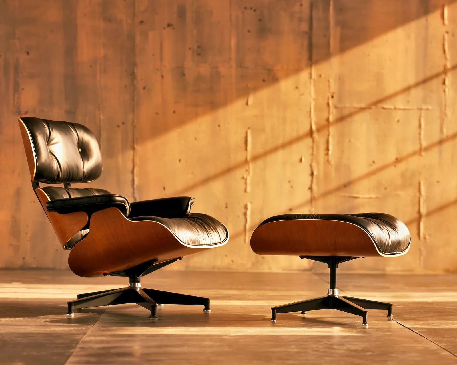
Eames Lounge Chair and Ottoman
1) Why this piece is so special We think this is the moment modernism learned manners. Plenty of chairs look sharp; very few feel like an embrace. The Eames Lounge Chair and Ottoman resolves that tension with easy confidence—industrial technique serving humane comfort. It isn’t about flash or bulk; it’s about pitch, contour, and how the molded shells cradle you while the ottoman floats your legs at the right height. The silhouette—three cupped plywood petals on a spare aluminum spine—stays calm from every angle. Charles said they wanted the “warm receptive look of a well-used first baseman’s mitt,” and that’s the target: a chair that invites instead of postures. For us, it sets the standard for what a lounge should do—instantly relax the body and quietly upgrade the room. Comfort isn’t a compromise here; it’s the point. 2) The piece’s history The chair capped the Eameses’ decade of plywood work—wartime splints and the LCW/LTW—pushed to a luxurious end in 1956. Debuting on national television, it made the case that modern could also be plush. The build still feels tight and purposeful: three molded-plywood shells joined by rubber shock mounts for a little give, leather-wrapped cushions that float independently, and a die-cast aluminum base you barely notice. Early versions used Brazilian rosewood; later models moved to sustainable veneers, but the ethos held: hand-matched grain, careful upholstery, and finishes that earn patina. Unlike many mid-century designs that faded or froze, this one never left production—licensed in the Americas by Herman Miller and in Europe by Vitra—absorbing small improvements (two sizes, refined foams, better finishes) without losing intent. That continuity matters. It isn’t nostalgia; it’s proof a good idea can maintain itself. 3) The piece in popular culture If you want a quick sketch of mid-century aspiration, you draw this chair. It’s in MoMA’s collection and in living rooms that telegraph taste with a single curve. You’ve seen it in Mad Men’s glass offices, in Frasier’s high-low apartment, and in tech lairs from Iron Man to the real founder class. Designers use it like a pressure valve: drop one in a severe space and the room relaxes; park it next to something ornate and it modernizes the conversation. Its ubiquity spawned a cottage industry of knockoffs, which only proves the original’s gravity. The difference is in the subtleties: the correct recline (fixed, not a mechanism), resilient shock mounts, and upholstery that ages like a leather jacket, not a car seat. Few objects have traveled so smoothly from museum pedestal to daily life. The Eames Lounge Chair didn’t just survive the mid-century revival; it authored it—and it still sets the pace for what a serious lounge should be today.
furniture
lounge-chair
ottoman
mid-century
molded-plywood
american
view Carl Hansen & Søn Wishbone Chair
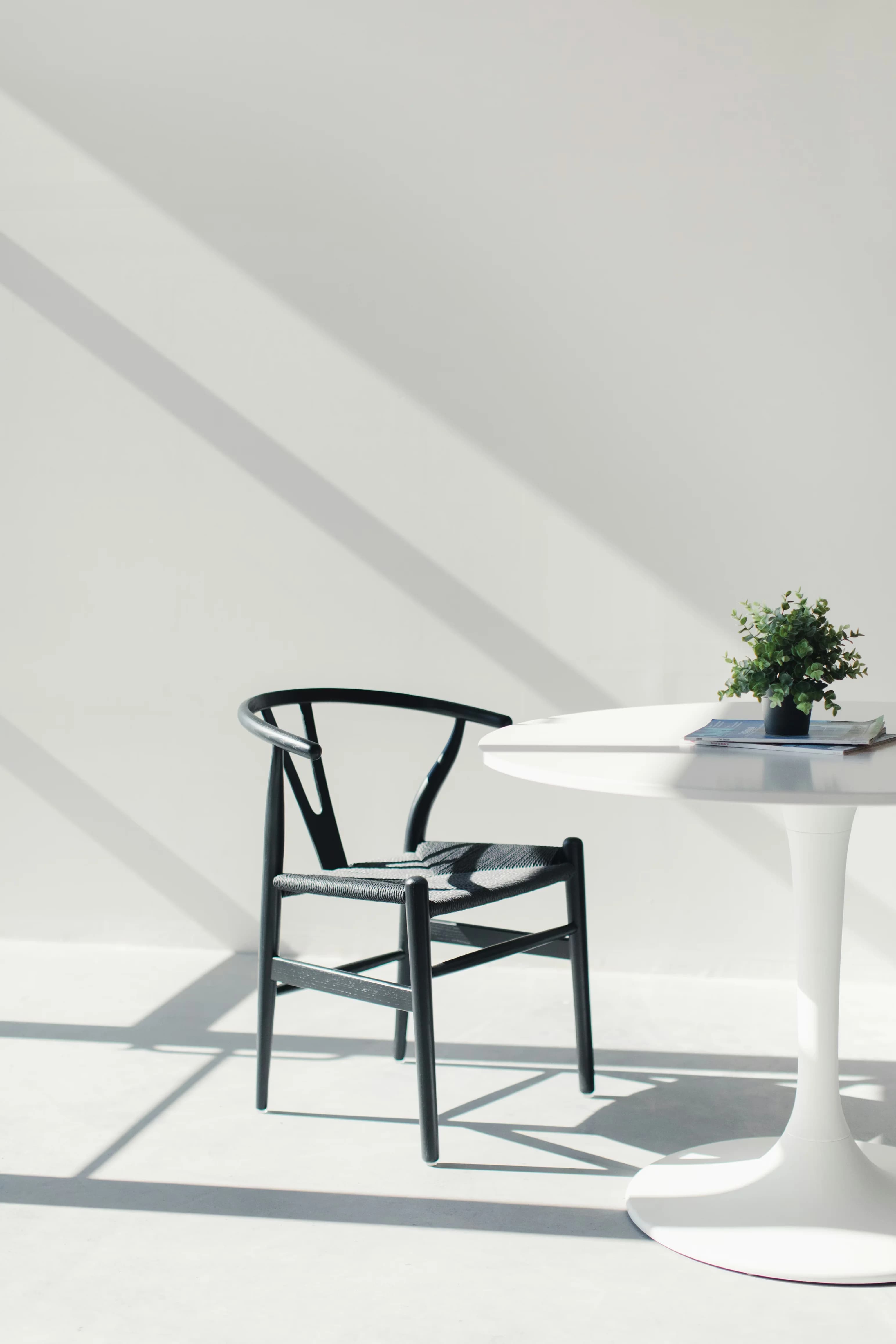
Carl Hansen & Søn Wishbone Chair
We think the CH24 is the dining chair that ends the search. Wegner distilled comfort, structure, and silhouette into a single gesture: the steam‑bent top rail that becomes the arm, braced by a Y that sets you upright without bossing you around. The hand‑woven paper‑cord seat has give without bulk; it breathes in summer and warms in winter. It’s light to pick up, generous to sit in, and strong enough to live with every day. Under a table, the chair recedes; in a room, it gives the space a clear spine. Most chairs choose either craft or daily use. This one ties them together. Copies exist by the truckload, but the original is still the one to live with: proportions that land, joinery you can read, and comfort that lasts past dessert. We reach for the CH24 when the brief is simple—fewer, better things, no drama, no soft compromises. Designed in 1949 and launched in 1950, the CH24 comes from Wegner’s study of Ming‑era Chinese chairs. He didn’t mimic; he edited. Mass shaved where it wasn’t earning its keep, steam‑bent wood tracing that horseshoe form, the Y‑splat doing the minimum to do the job. Carl Hansen & Søn had the patience and tooling to make it repeatable without sanding off the soul. Building one still takes more than a hundred steps, including hand weaving about 120 meters of paper cord per seat. The method is the shape: visible mortise‑and‑tenon joints, a carved and bent top rail, legs subtly tapered with a stance that feels poised, not precious. Wood and finish options have widened—beech, oak, ash, cherry, walnut; soap, oil, water‑based lacquer—but the fundamentals haven’t shifted. Production stays in Denmark, on Funen. Decades of repetition didn’t dull the craft; it tuned it. The Wishbone is shorthand for good taste without fuss. Architects specify it when they want a room to read as intelligent rather than loud. Restaurateurs fill dining rooms with it because it’s comfortable for hours, moves easily for service, and photographs beautifully. We see it everywhere materials and light do the talking: Scandinavian townhouses, Californian bungalows, Tokyo coffee bars. Special editions and color runs come and go, but the core appeal doesn’t move. The chair plays with everything—from farmhouse planks to marble slabs—and never asks for attention. The clearest cultural tell is the number of imitations. When a silhouette goes universal and the original still looks and feels better, you’re looking at an archetype. For us, the CH24 isn’t just a classic. It’s the default setting for what a dining chair should do: sit well, last well, and keep its dignity while it works.
furniture
Wishbone
Y Chair
CH24
Danish modern
Hans J. Wegner
view Herman Miller Aeron Chair
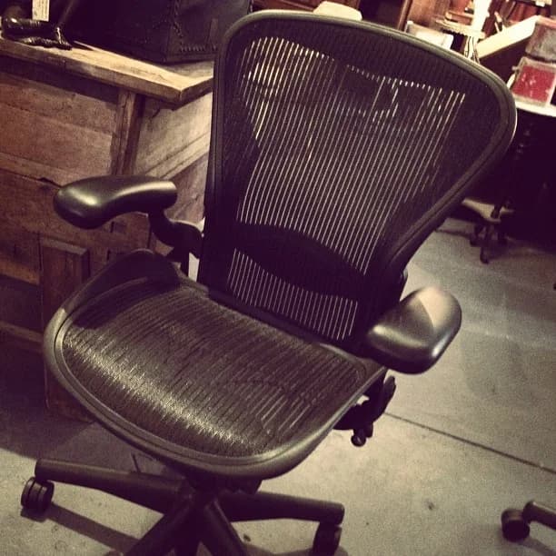
Herman Miller Aeron Chair
In our view, the Aeron did for office seating what the Submariner did for dive watches: it set the template everyone else chases. It stripped the executive clichés—leather, padding, shiny trim—and replaced them with a performance mesh that made comfort visible. Pellicle suspension moves and breathes, letting heat and moisture dissipate. That sounds mundane until hour five of a meeting. More important, Aeron reframed the chair as equipment. Three sizes (A, B, C), micro‑adjustable arms and tilt, and posture support that works with your spine turn long sessions into something sustainable. You don’t perch; you’re held. Herman Miller’s 2016 Remastered pass didn’t change the idea; it tightened it. Zoned Pellicle varies tension where you need it, the tilt is smoother, and PostureFit SL supports sacrum and lumbar together. The chair doesn’t force a pose. It adapts as you lean, type, or think, which is the whole point. Designers Bill Stumpf and Don Chadwick arrived at Aeron after the Equa, with research that looked at real bodies—older, larger, smaller, and in motion. The insight was blunt: stop trying to pad the body into submission. Support it, cool it, and spread load without bulk. They prototyped an elastomeric suspension and built a frame that let it do the work. When Herman Miller launched Aeron in 1994, the market blinked. Some called it skeletal, even ugly. Then people sat in it. The weirdness became an advantage: lighter, more breathable, more adjustable than the status chairs it displaced. By the late ’90s, Aeron was everywhere and the industry pivoted from décor to dynamics. It sold in huge numbers without losing the core engineering idea. Remastered in 2016, Herman Miller kept the silhouette and reworked the internals. Zoned Pellicle improved pressure distribution; the tilt mechanism got more intuitive; PostureFit SL added targeted support you actually feel after lunch, not just in the showroom. Same silhouette, better tool. Aeron became the backdrop of the dot‑com boom. Rows of mesh and magnesium signaled you were building the future, not filing it. IPO decks, magazine spreads, and stock photos used its insect‑like frame as code for modern work. Set designers still drop it into scenes when they need ambition without mahogany. Its ubiquity made it almost invisible, which is a win. When an object turns into the default, it stops acting like a prop and starts acting like infrastructure. That’s the Aeron’s cultural trick. It reset expectations: a chair for knowledge work should be engineered like sports equipment—precise, breathable, adjustable. Decades on, the category still speaks Aeron’s language, because the chair taught everyone what “good” feels like.
furniture
american
mesh-office-chair
ergonomic
adjustable-armrests
lumbar-support
view Lamy 2000 Fountain Pen

Lamy 2000 Fountain Pen
We think the Lamy 2000 proves that good design should disappear in use. No jewels, no scrollwork—just Makrolon and steel shaped into a tool that writes as confidently as it looks. The cap seam is barely there. The spring-loaded clip holds without chewing fabric. The brushed body shrugs off fingerprints and glare. The piston filler feels like practical luxury: real ink capacity and a small ritual, no drama. The partially hooded 14k nib starts without fuss and stays consistent. Balance is spot-on unposted, steady posted, and the taper into the section encourages a relaxed grip. Even the cap’s soft click feels considered. Everything here earns its spot; nothing begs for attention. In daily use, the 2000 fades into the background in the best way. It lets you think about the work, not the pen. Released in 1966 and designed by Gerd A. Müller, the 2000 set the template for its maker’s modernist language. Makrolon—glass-fiber–reinforced polycarbonate more common in industry—became the skin for its warmth, stability, and toughness. Brushed stainless steel adds structure and a tactile break. A 14k nib sits partly hooded for control and to resist drying. The clean cylinder, small ink window, and nearly invisible seams weren’t styling exercises; they solved problems: grip, balance, maintenance, discretion. This was postwar German design with priorities straight—engineering, restraint, longevity. The 2000 didn’t mimic tradition or chase novelty. It turned a utilitarian object into a precise, durable tool and made that approach the brand’s north star for decades. Aside from small updates, the design has stayed intact because it didn’t need fixing. The 2000 sits in a rare middle ground: the designer’s pen that also suits everyday carry. It shows up in architecture studios, on minimalist desks, and in the “buy one good pen” lists that circulate every year. Writers lean on it for long sessions; product teams take it into pitch meetings; students keep it through grad school. It’s the quiet alternative to heritage flourishes and the modern answer to disposable plastic. The silhouette is instantly readable without being loud. It signals a stance—less, but better; durable, not disposable. We think that’s why it keeps crossing scenes and generations. It doesn’t chase trends or nostalgia. It offers a consistent, capable baseline for analog work, from bullet journals to boardrooms. If the fountain pen has a modern archetype, this is it—still relevant because it never tried to be anything else.
stationery
fountain-pen
piston-filler
bauhaus
makrolon
german
view Montblanc Meisterstück Fountain Pen
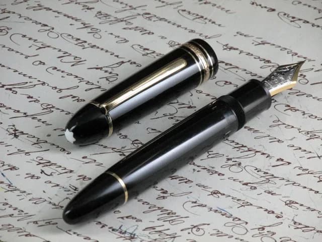
Montblanc Meisterstück Fountain Pen
We think the Meisterstück 149 is the fountain pen stripped to essentials and scaled with intent. It doesn’t chase nostalgia or gadgetry. It focuses on feel: a big, balanced body, a piston that drinks enough ink for weeks, and a gold nib with broad shoulders that lays down character without fuss. The cigar shape fills the hand and then disappears; you don’t need to post the cap, and you won’t want to rush. Using one becomes a small ritual—twist, draw, wipe, write—that puts attention back on the line you’re making. Plenty of pens try to signal importance. The 149 earns it by working day after day, year after year. For us, this is the reference “executive pen”: not a desk trophy, a dependable instrument that quietly raises the stakes of anything you sign or sketch. Montblanc launched the Meisterstück line in 1924 as its top tier; the 149 arrived in 1952 and took the flagship spot. The snowcap emblem predates both (1913), and “4810” on the nib nods to Mont Blanc’s height. Early 149s were celluloid with ebonite feeds; later pens adopted the brand’s deep black resin and updated internals. Through decades of tweaks—nib alloys moving from 14C to 18K, feed designs, trim variations—the core never changed: a large format, three cap bands engraved “Meisterstück,” an ink window, and a smooth piston that makes bottled ink practical. That quiet evolution matters. Montblanc kept refining tolerances, finishes, and serviceability without disturbing the silhouette. The result is a pen that still feels current because the fundamentals were right from the start and the company resisted the urge to fix what wasn’t broken. The 149 reads “decision-maker” from across a room. Prop masters use it when they need instant authority; gift buyers choose it when the moment needs weight—promotions, graduations, signings. Crucially, it escaped becoming just status décor. Lawyers, editors, architects, and novelists actually use these, because the nibs are expressive across sizes, the piston is reliable, and the pen shrugs off daily carry. It has a devoted collector scene—early celluloid examples, telescopic pistons, rare nib grinds—but the living culture is people writing with them. That is the 149’s real imprint: it pulled the fountain pen out of nostalgia and into modern ritual, proving an analog tool can still anchor serious work in a digital world. And while competitors have launched their own flagships, the silhouette everyone recognizes—the big black cigar with three bands and a confident clip—still points back to this one.
stationery
fountain-pen
piston-filler
german
gold-nib
resin
view Levi's 501 Jeans
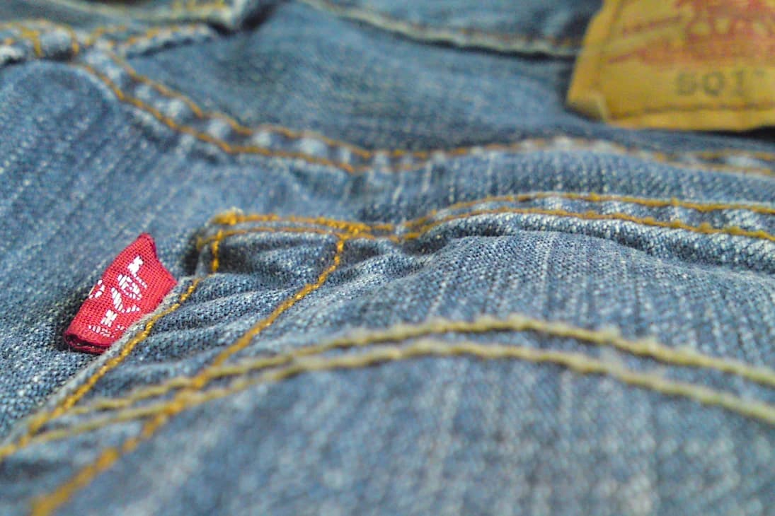
Levi's 501 Jeans
We think the 501 is the control sample of jeans—everything else is a variation. Straight leg, button fly, five pockets: that’s the grammar of denim. While other trousers chase novelty, the 501 sticks to proportion and restraint. The cut is democratic—not skinny, not baggy—so it works with boots, sneakers, and everything up top from chore coats to blazers. The details serve the job: copper rivets at stress points, bar tacks where abrasion wins, and an arcuate stitch that signals lineage rather than shouting for attention. If you pick shrink‑to‑fit, the break‑in becomes part of the design; you finish the pattern with your body and your habits. In our view, the 501 matters because it’s honest. It doesn’t pretend to be luxury or techwear. It’s just the right tool for daily life—on a job site, a stage, or a gallery floor. That quiet utility is why the 501 has outlasted trend cycles and still answers the same question: what should jeans be? The 501 descends from Jacob W. Davis’s 1873 riveted “waist overalls,” patented with Levi Strauss to stop work pants from splitting. In 1890, Levi Strauss & Co. assigned lot number 501 to the flagship riveted jean, and the template set. Progress was incremental and practical: belt loops in 1922 for the belt era; the red tab in 1936 to spot fakes; back‑pocket rivets covered in 1937 to save saddles and furniture; wartime rationing simplified stitching; the 1947 pattern cleaned up into the modern, straight‑leg silhouette; and in 1966, those back rivets gave way to bar tacks. Sanforized and stonewashed variants came and went; shrink‑to‑fit stayed for purists. Manufacturing shifted from U.S. plants to a global network, but the spec—straight leg, button fly, five pockets, red tab, two‑horse patch—endures. The 501 is industrial design tuned by iteration: a century of small, sensible changes that protect the idea and refine the wear. The 501 moved from labor to rebellion to default uniform. In film and music, it reads as unforced American cool. Schools tried banning denim; demand only grew. Bruce Springsteen turned the back pocket into an album cover. Steve Jobs made 501s part of his daily uniform, proof that the simplest thing in the room can be the smartest. The 1985 “Launderette” ad reintroduced the button fly to a new generation and made the 501 a global rite of passage. Punks, skaters, truckers, artists, and designers all wear the same jean for different reasons—that’s the point. When culture wants authenticity, it reaches for 501s. They don’t shout; they anchor.
apparel
denim
button-fly
straight-leg
selvedge
shrink-to-fit
view Burberry Trench Coat
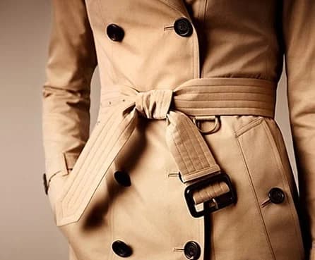
Burberry Trench Coat
We think the Kensington is the trench boiled down to essentials: everything you need, nothing you don’t. The cut is the win—room to clear a blazer, lines sharp enough to read as tailoring. Most copies miss this balance and either swamp the body or choke the chest. Burberry’s cotton gabardine starts crisp and breaks in the right way; it softens without sagging and shrugs off weather. The storm shield, throat latch, epaulettes, cuff straps, and D‑ring belt aren’t costume—they still earn their keep. Hardware feels robust, the leather‑wrapped buckles don’t squeak, and the belt actually holds a cinch without wrinkling the front. What sets the Kensington apart is proportion and discipline: lapels that frame the face, pockets placed where your hands land, and a skirt that turns rain into movement. The coat doesn’t shout. It settles you. You don’t just put it on—you assume it. Thomas Burberry’s 1879 invention of gabardine rewired outerwear: tightly woven, breathable cotton that kept out rain without the rubbery bulk. His 1895 Tielocken—no buttons, a belt closure, storm protection—mapped the modern trench. War added the functional furniture: epaulettes for rank, the gun flap for runoff and recoil, a back shield for ventilation. Civilians kept the format because it works. In the 2010s, Christopher Bailey recut the “Heritage” line with a firm edit rather than a reinvention. Three fits emerged: Sandringham (slim), Kensington (tailored), Westminster (relaxed). The Kensington is the middle path—the one most wardrobes can live with. It’s made in England—gabardine woven in Yorkshire, stitched in Castleford—with pattern‑matching that respects the check where it shows, horn buttons, and leather‑trimmed buckles that don’t feel like afterthoughts. The result reads like a conversation between archive and factory, not a mood board. It keeps the brief of the original and fixes the ergonomics for how we move now. The trench is cinematic shorthand for resolve: detectives under neon, lovers at the platform, artists between studios. Film noir made it a silhouette; postwar life made it city gear. We think the Kensington is the clearest present‑tense version of that idea. It cleans up a suit, disarms a hoodie, and keeps branding quiet. In music videos, street photography, and the inevitable airport shot, a good trench reads as intention. That’s why it keeps resurfacing: it makes ordinary clothes look considered. If a wardrobe is a toolkit, the Kensington is the torque wrench—precise, reliable, oddly empowering. You buy it for rain and wind. You keep it because it edits your posture and your day.
apparel
british
trench-coat
gabardine
water-resistant
double-breasted
view Honda Super Cub
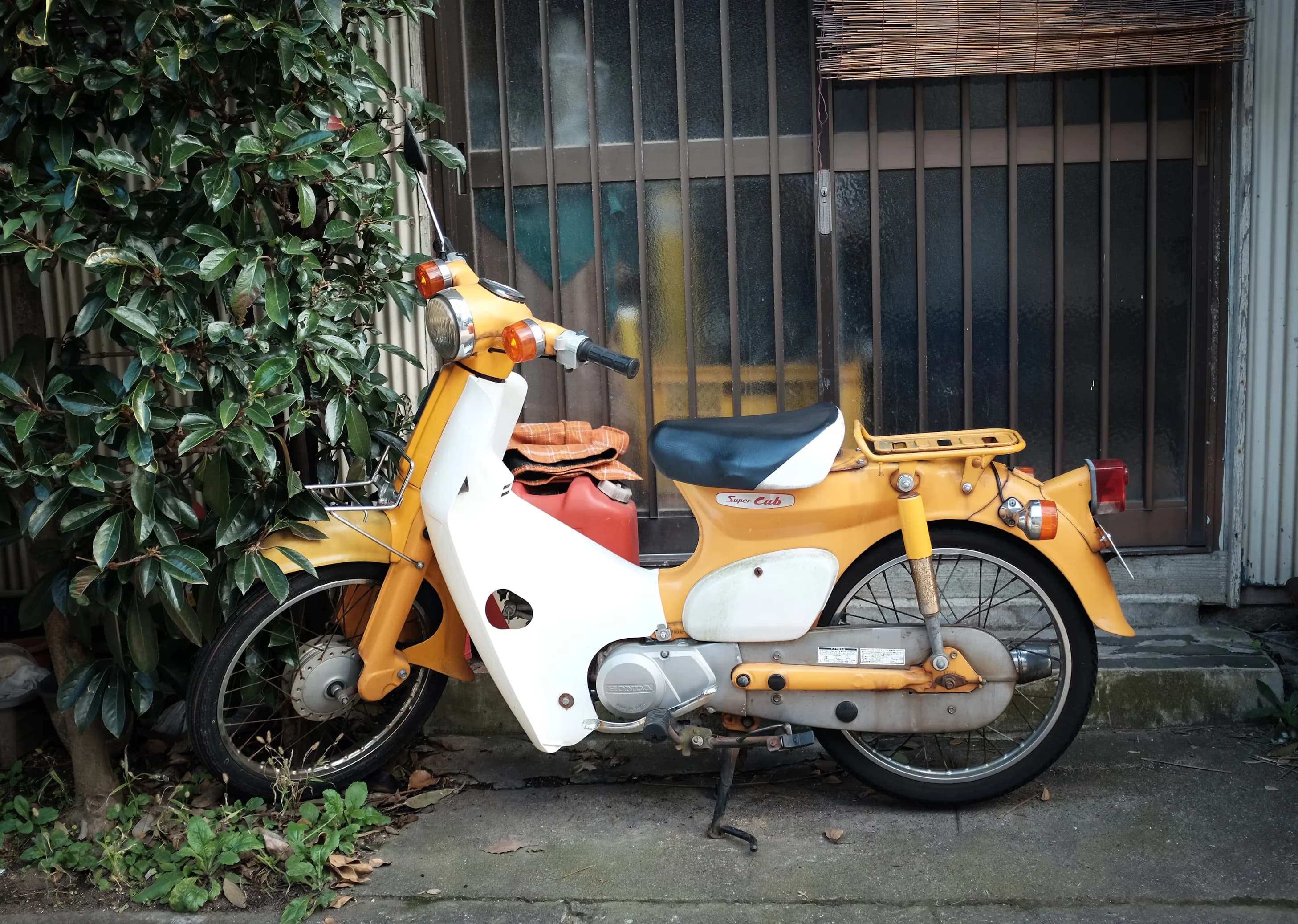
Honda Super Cub
In our view, the Super Cub is design as social infrastructure. It isn’t about speed or swagger; it’s about dignity, access, and the quiet triumph of things that simply work. The pressed‑steel step‑through frame invites everyone—skirts, suits, grocers, grandmothers—without intimidation. The automatic centrifugal clutch and foot‑shift remove ceremony from riding, leaving utility and a smile. We think of it as the people’s mobility appliance, but with a warmth and rightness few “appliances” ever achieve. It’s the most‑produced motor vehicle on Earth for a reason: it miniaturized freedom, made reliability a promise instead of a boast, and proved that good manners in design—ease, economy, empathy—can change how whole societies move. The brief in 1956 was blunt: build a machine anyone could ride, anywhere, every day. Soichiro Honda and Takeo Fujisawa skipped the scooter cosplay and engineered a local answer: an underbone monocoque for strength and a low step‑through; a clean, quiet 49cc four‑stroke; and a plastic leg shield to keep clothes tidy. Launched in 1958, the C100 didn’t court enthusiasts; it courted everyone. The choices were radical for their restraint: oil‑tight castings, long service intervals, and a clutch you couldn’t burn because you never had to touch it. As Honda exported derivatives (C50/C70/C90) and built factories close to riders, the Cub became the backbone of small enterprise across Asia, Africa, and Latin America. By the time “You meet the nicest people on a Honda” softened motorcycling’s image in the West, the Cub had already done its real work: it normalized powered two wheels as honest, everyday infrastructure. Decades and well over a hundred million units later, the DNA remains intact—proof that when purpose is right, the sheet metal and plastics can stay modest and the idea still feels fresh. The Super Cub doesn’t posture; it permeates. Street photographers treat it as a moving constant from Hanoi to Tokyo; postal red Cubs and ramen‑rack Cubs are civic furniture as much as vehicles. In pop music, the Beach Boys’ “Little Honda” put small‑cc freedom on the radio. In contemporary media, the manga and anime Super Cub turned a humble commuter into a coming‑of‑age companion, which tracks: the Cub makes life larger without making a fuss. More quietly—and more importantly—it rewrote who a “motorcyclist” could be. It invited families, shopkeepers, students, and office workers. It extended the radius of jobs, school, and care. If design’s highest calling is to expand the circle of participation, the C100 is the blueprint. We think it’s not just a motorcycle; it’s the clearest piece of human‑scale mobility design ever put into production.
bikes-transport
japanese
step-through
underbone
automatic-clutch
four-stroke
view Brompton C Line
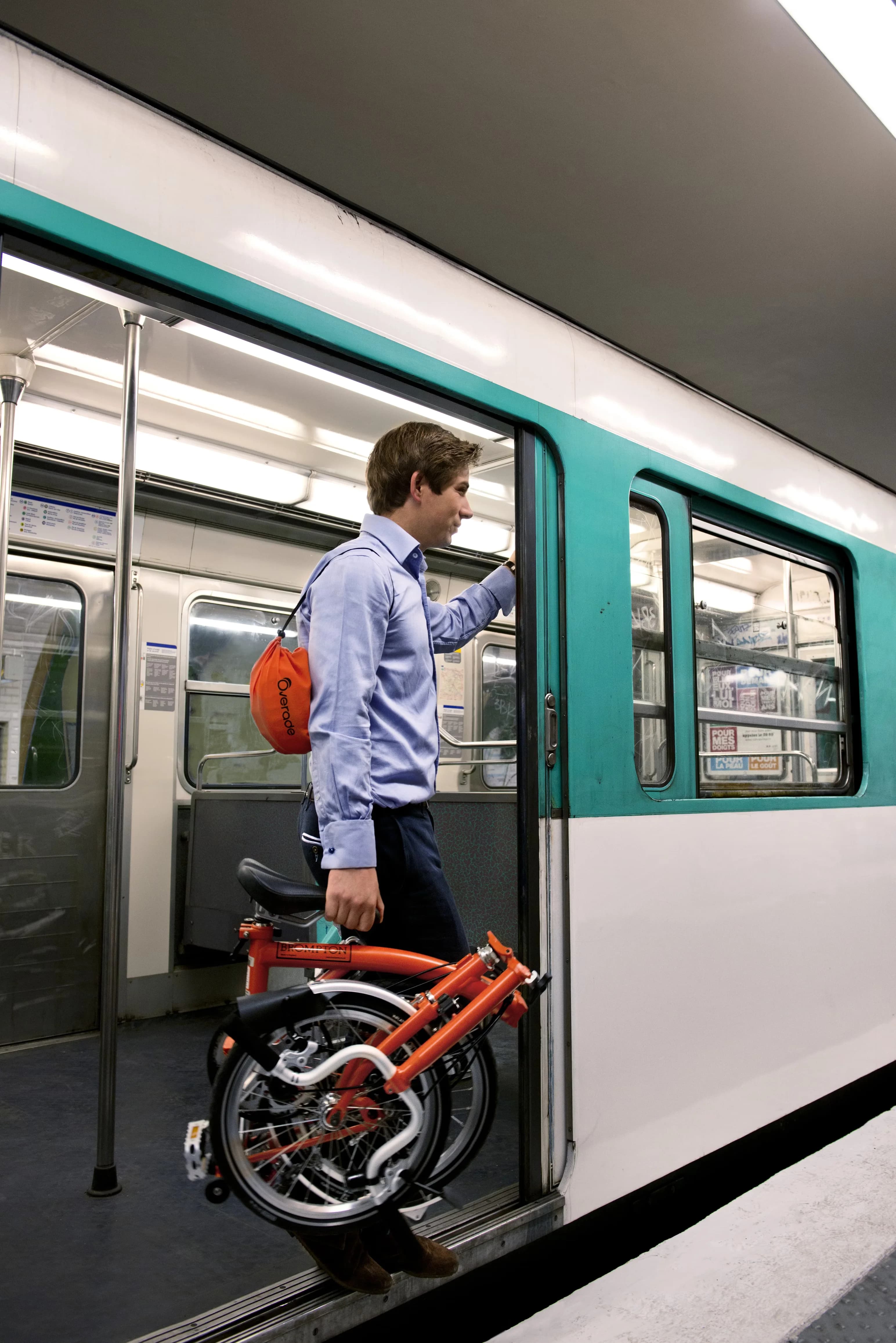
Brompton C Line
We think the C Line is the rare folding bike that erases the usual compromise. Most folders either ride like luggage or fold like a bike; this does both properly. The brazed steel frame gives it a quiet, springy feel, and the fold is a quick, repeatable ritual that ends in a clean, self‑standing bundle. That tight package isn’t a party trick—it’s a passport. It slides under a desk, onto a train, into a closet, through a revolving door. In use, the city stops being a patchwork of bike‑friendly zones and becomes one continuous network. Small 16-inch wheels and smart geometry make it jump from the lights, the gearing options are sensible, and the hardware shrugs off weather and daily abuse. Plenty of bikes are fast, and plenty fold. The C Line earns its space because it makes everyday life faster and simpler. Andrew Ritchie drew the first Brompton in the mid‑1970s, determined to fix flimsy folders. His solution was a three‑part fold that nests wheels and chain away from clothes, paired with brazed steel for longevity and ride quality. Early runs in the 1980s were tiny and fragile as a business, but the idea was right: commuters wanted a bike that respected wardrobes, flats, and time. Brompton then did the unglamorous work for decades—better hinges, smarter gearing, tougher paint, stronger rims—without breaking the core architecture. In 2022 the company cleaned up its range and named the classic all‑steel model the C Line. The fundamentals stayed intact: London‑made frames, lugs and tubes joined by hand, parts chosen for serviceability and spares support. It’s not nostalgia; it’s a living platform refined in public over forty years, with changes made when they matter and left alone when they don’t. Few objects signal a city’s rhythm like a Brompton snapping shut on a platform as the doors beep. The C Line has become commuter punctuation in London, Seoul, Tokyo, and New York—seen in station queues, elevators, and offices where full‑size bikes never go. The Brompton World Championship, with its jacket‑and‑tie dress code and Le Mans starts, turned practicality into theater and made the fold a cultural gesture. On social feeds, the C Line reads as urban competence: a tidy cube under a café table, a flash of steel by a turnstile. The appeal isn’t speed bragging; it’s the freedom to ignore parking, theft, and storage. Like the Zippo, the Leica M, or the Swiss Army Knife, it’s a tool whose mechanism is the message. You buy it for the ride; you keep it because it changes how you move through the world.
bikes-transport
folding-bike
compact-fold
steel-frame
commuter
british
view Technics SL-1200MK2
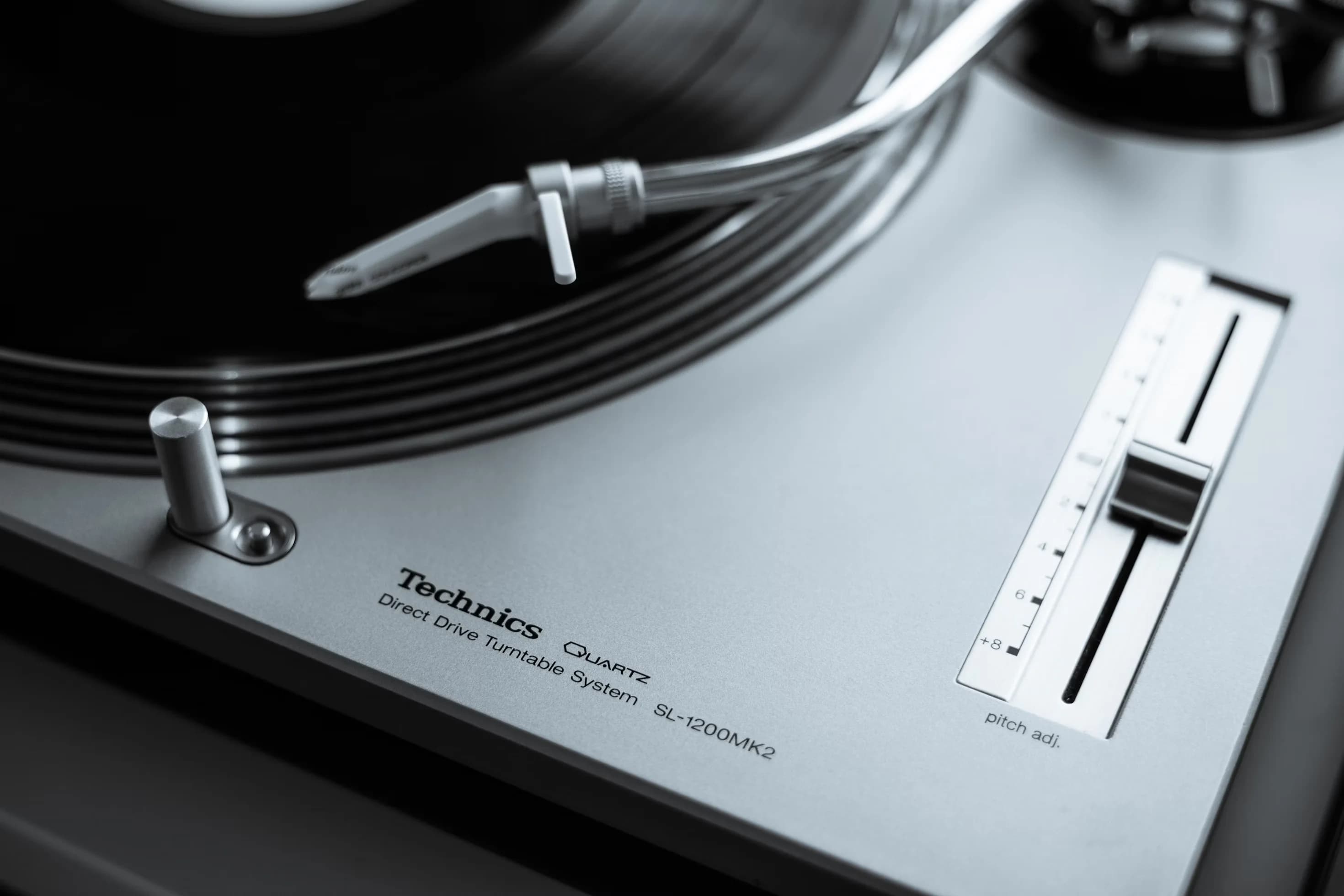
Technics SL-1200MK2
We think the SL-1200MK2 is where a turntable becomes an instrument. Plenty of decks spin at 33⅓; this one locks pitch, hits speed now, and ignores the racket of a club. Quartz lock isn’t a party trick—it’s trust when the kick lands exactly where you placed it. The 100 mm pitch fader isn’t just a control; it’s a vocabulary you learn by feel. And the heft—die‑cast platter, dense composite plinth, gimbal‑bearing tonearm—signals intent: not just for the sofa. Start/stop is instant, back‑cueing doesn’t rattle it, and the layout is as legible in the dark as it is in daylight. In our view, this is the archetype of the performance turntable, a machine whose reliability recedes so technique can lead. If greatness in design is measured by how fully it enables culture, the MK2 is hard to top. The SL‑1200 line starts in 1972, but the 1979 MK2 is the pivot: quartz‑controlled direct drive paired with a precise, center‑detented ±8% pitch slider. Shuichi Obata’s language is direct—no gimmicks, just clear controls, mass where it matters, and smart isolation. Built in Japan by Matsushita (later Panasonic), the MK2 evolved a hi‑fi deck into a professional tool that could live in radio booths, sound systems, and clubs without flinching. Motor torque and speed stability made back‑cueing and beatmatching possible without shredding belts or drifting tempos. The rubber‑damped chassis, adjustable feet, and serviceable parts kept them running under abuse. Production longevity, spares, and repairability turned the 1200 into infrastructure, not ephemera. When Technics paused the line around 2010, the reaction wasn’t nostalgia; it was fear of losing the standard. The 2010s revival only confirmed what users had proven for decades: this platform wasn’t a fad—it was the reference. We think the SL‑1200MK2 is the most consequential piece of audio hardware in late‑20th‑century popular music. Hip‑hop’s scratching, cutting, and juggling rely on its torque and control. House and techno’s long, hypnotic blends assume its pitch linearity and feel. DMC battle rules effectively canonized it as the stage instrument, and club riders worldwide quietly did the same. The silhouette—stout plinth, S‑shaped arm, strobe‑dotted platter—reads as shorthand for DJ culture on flyers, album sleeves, and film. More importantly, it changed how musicians think: the turntable stopped being playback and became performance. That’s the highest bar for design—enabling a new behavior so convincingly it becomes normal. Long after digital lowered the effort, the MK2 still anchors booths and studios because it does something software can’t: turn mass, friction, and human touch into music with total composure. That’s cultural gravity you can feel through your fingertips.
audio-electronics
direct-drive
dj-turntable
quartz-lock
pitch-control
japanese
view Estwing Straight Claw Hammer
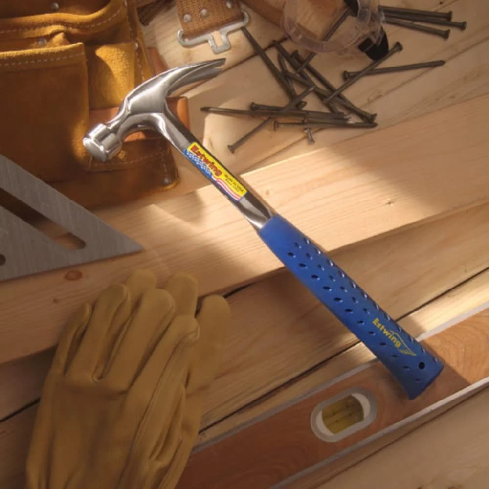
Estwing Straight Claw Hammer
In our view, the E3-16S is the general-purpose hammer to beat: a single piece of forged steel shaped with calm confidence. The straight (rip) claw isn’t a flourish; it’s the point. It pries, pulls, and chisels with control that curved claws can’t match. The smooth face is kind to finish nails, the balance delivers square blows without drama, and the blue Shock Reduction Grip takes the sting out of repetitive hits. Plenty of hammers drive nails; this one disappears in the hand while it does. That’s the highest compliment we can pay a tool: it lets you focus on the work, not the tool. Estwing has been forging in Rockford, Illinois since 1923, when Ernest O. Estwing committed to a simple idea: make a hammer from one continuous piece of steel. No wedges, no joints, no weak points. That decision set a durability standard competitors still chase. Across decades the company tuned the geometry, polish, and heat treatment, and in 2001 paired the steel with a molded Shock Reduction Grip that tames vibration without turning the handle into a gimmick. The 16-ounce straight-claw format lands in the sweet spot for daily carpentry: light enough to live on a belt, stout enough for framing, and precise enough for trim in the right hands. The E3-16S isn’t nostalgia. It’s an iterative tool refined by jobsite feedback, surviving because it keeps being the right answer. You can map American building in blue: that handle shows up on renovation shows, in tool guides, and in countless jobsite photos. The E3-16S didn’t become familiar because a prop master pushed it; it did because working people brought it to work. When a tool becomes shorthand for competence, it crosses from hardware into shared language. We think the E3-16S lives there. It’s the hammer friends lend without worry, the one that comes back from a weekend project with new scuffs and no excuses, the one you buy again only because the first one walked off. In a market crowded with cleverness, the E3-16S still argues for the honest virtues—balance, toughness, and a single piece of steel that won’t loosen—and wins. If design is problem-solving, this is the direct line from intention to result.
tools-hardware
straight-claw
one-piece-forged
smooth-face
american-made
carpentry
view Victornox Swiss Army Knife
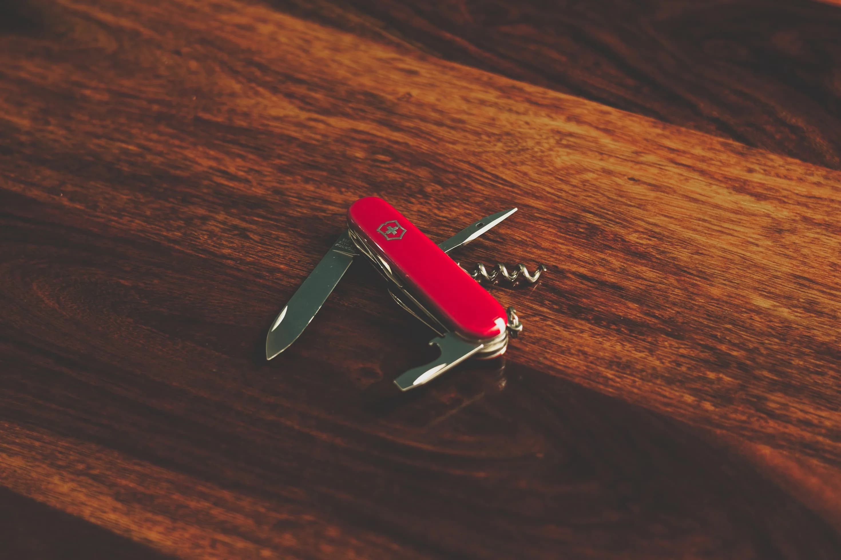
Victornox Swiss Army Knife
We think the Classic SD is the clearest case for everyday design that actually earns its keep. It’s tiny, unassuming, and ruthless at solving small problems. The blade opens packages without drama. The scissors—shockingly good for their size—snap through loose threads and hangnails with a clean, confident cut. The nail file ends in a flat‑head tip, which is the “SD”: a screwdriver and light pry that fixes the micro‑snags that derail your day. Most important, it lives on your keys, so it’s there when you need it. That’s the line between design as styling and design as infrastructure. For the price of a forgettable lunch, you get years of readiness, built by a factory that still obsesses over spring tension, edge geometry, and the satisfying snap of a properly tuned backspring. This isn’t a conversation piece. It’s why you get to keep the conversation moving. The Classic SD comes from Karl Elsener’s 1897 Officer’s Knife—the template that made “Swiss Army Knife” mean multi‑tool. As the idea spread through the 20th century, the 58 mm “Classic” pattern boiled it down to essentials: blade, scissors, nail file, tweezers, toothpick, keyring. The SD suffix turns the file into a small screwdriver, multiplying utility without adding bulk. While the broader family runs from outdoors to ordnance, the Classic SD nailed the everyday use case. It carried forward Victorinox fundamentals—corrosion‑resistant steel, tight tolerances, and parts that are riveted, peened, and hand‑tuned instead of fussy or fragile—into a pocket format that makes sense for students and office workers as much as mountaineers. The lineage feels inevitable in hindsight: a universal tool made personal by its scale, its color options, and the patina of use. It’s the one you actually have on you, which makes it the one that matters. The Swiss Army Knife is cultural shorthand for capability; the Classic SD is the pocketable proof. From MacGyver gags to NASA tool rolls, the silhouette reads as competence with a conscience—resourceful, not aggressive. The Classic SD in particular has become a canvas for special editions, museum‑shop runs, tourist graphics, and the quietly perfect gift for people who don’t want more stuff. It also taught a generation the rules of airport security, earning a spot in travel lore as the most‑confiscated object you immediately replace. We see it everywhere because it works everywhere: on keychains, in pencil cups, in glove boxes and tackle boxes, and in the drawer you actually open. If the multi‑tool is a category, the Classic SD is the archetype—proof that small is sufficient and that good design pays rent one solved problem at a time.
tools-hardware
swiss
multi-tool
keychain-knife
scissors
compact
view Rimowa Original Cabin

Rimowa Original Cabin
In our view, the Original Cabin is the travel equivalent of a mechanical watch: overbuilt, purposeful, and meaningful beyond utility. It isn’t shiny status armor; it’s engineered ritual. The ridged aluminum shell does something few objects manage today—it earns character. Every scuff becomes a stamped visa, each dent a story from a conveyor belt or curb. What we admire most is the balance: industrial clarity with human warmth. The multiwheel glide, the crisp snap of the locks, and the quiet resolve of that aluminum shell make it feel less like baggage and more like a companion. Plenty of cases promise durability; this one reframes it as patina, turning real wear into part of the design. The details matter: a metal frame with gaskets instead of a zipper, riveted corners you can service, a telescoping handle that doesn’t wobble, and wheels that track straight without shouting about it. It’s not the lightest, and it will dent. That’s the point. The suitcase documents the miles you put through it and keeps working. The DNA predates the carry-on category itself. In 1937, Richard Morszeck pushed the company toward aluminum after a factory fire left metal as what survived—a pragmatic decision that became identity. By 1950, the distinctive grooves appeared, borrowing the corrugated language of early German aircraft to add stiffness and a visual signature. What later became the “Original” line runs straight from those mid-century trunks through decades of incremental German engineering: stronger alloys, reinforced corners, better wheels, tighter seals, and, eventually, standard TSA locks. The name changed—Topas to Original in the late 2010s—but the intent did not. RIMOWA has tuned this object the way a maker tunes a tool: continuous refinement, no wholesale reinvention. That’s why it feels canonical. In a market of seasonal drops and novelty plastics, this suitcase stays rooted in an industrial lineage that predates jet travel. The Original Cabin lives at the intersection of aviation romance and modern street culture. It’s as at home in a first‑class aisle as it is in a backstage corridor. Collaborations and limited runs pushed it from connoisseur signal to cultural shorthand: proof that serious engineering can double as a canvas. Stickers became their own subculture, not to hide scuffs but to layer memories onto them. The mainstream spotlight didn’t dilute its purpose; if anything, it raised expectations for how luggage should perform and age. We think its pop appeal rests on a simple truth: the grooves broadcast movement. Even parked by a hotel desk, the case looks like it’s going somewhere. That kinetic promise attracts creatives, executives, and frequent flyers to the same object—and explains why airports now hum with the sound of those small, sure wheels.
bags-luggage
german
carry-on
cabin-luggage
aluminum
grooved
view Ray-Ban Wayfarer
Ray-Ban Wayfarer
The Wayfarer is where sunglasses stopped just blocking glare and started sending a signal. We see it as the archetype of the assertive plastic frame: a sharp, trapezoidal silhouette with a purposeful forward tilt and a thick brow that acts like architecture for the face. Where wire frames whisper, the Wayfarer speaks in crisp, mid‑century lines and honest acetate. It flatters more faces than it should, feels steady on the bridge, and gives your field of view a slightly cinematic trim. The balance is the trick: rebellious without being costume, refined without turning polite. That mix is why the design hasn’t aged out, and why we still reach for it when we want our eyewear to add intent, not noise. Raymond Stegeman designed the Wayfarer in 1952 at Bausch & Lomb, using cellulose acetate to pull eyewear out of delicate metalwork and into sculptural plastic. It arrived alongside American product design’s big surfaces and jet‑age confidence—tailfins, molded plywood, optimistic geometry—and instantly pushed against wire‑rim tradition. Sales dipped in the 1970s, then an early‑1980s product‑placement blitz put the frame back on screens and back in circulation. By decade’s end, it was the default “cool” silhouette. Luxottica has owned Ray‑Ban since the late 1990s and has widened the family. The Original Wayfarer (RB2140) keeps the thicker front and signature forward tilt; the later New Wayfarer (RB2132) softens the angles and sits flatter. Variants come and go, lens tech improves, and colors cycle, but the core idea hasn’t needed fixing since Eisenhower. If you want the benchmark, get the one with the tilt. Few objects rack up a résumé like this. The Blues Brothers made them uniform. Tom Cruise in Risky Business turned them into a rite of passage. Miami Vice gave them prime‑time swagger. Musicians from Bob Dylan to Madonna used the silhouette as punctuation. The point isn’t any single cameo; it’s the casting choice. When filmmakers need instant attitude—smart, irreverent, unpretentious—they reach for a Wayfarer and move on. That’s also why the frame crosses scenes so easily: street, stage, boardwalk; black, tortoise, loud acetates. The branding stays small, the outline does the talking. Trends sprint through micro‑shapes and novelty lenses, but the Wayfarer remains the control sample—the reference curve in sunglasses design. We think of it as the frame you measure against, even when you decide to wear something else.
accessories
american
sunglasses
acetate
original-fit
square-frame
view Windproof Lighter (Classic Brushed Chrome)

Windproof Lighter (Classic Brushed Chrome)
We think the Classic Brushed Chrome Zippo is industrial design boiled down: a pocket rectangle, a lid on a hinge, a spark that becomes flame even when the weather turns sideways. The brushed finish favors forgiveness over shine; scratches blend into a quiet patina that maps your use. One-handed flip, solid cam, that clean click—it’s a small ritual that never gets old because it works. This lighter is rebuildable by design: flint, wick, and cotton are consumables, not compromises. You refill it, you replace parts, you keep it going. Zippo’s lifetime repair policy backs that attitude and puts throwaway lighters in a bad light. Are there tradeoffs? Sure. Fuel evaporates if it sits, and you’ll catch that faint fluid smell. We accept those as the cost of a mechanical, serviceable tool. Among pocket objects, few tie function, feel, and longevity this neatly. For us, this is the archetype of the windproof wick lighter—wind-ready, pocket-tough, and personal. In 1932, George G. Blaisdell watched a friend fight an Austrian storm lighter that could handle wind but not hands. He reshaped the idea: a compact brass case with a hinged lid, a perforated chimney to shelter the flame, and a flint wheel you could operate with one thumb. Production started in Bradford, Pennsylvania, in 1933; the U.S. patent followed in 1936. Wartime brass shortages pushed cases to painted steel—Black Crackle—putting dependable fire in the pockets of servicemen who learned they could fix, not toss, their lighters. After the war, brass returned and brushed chrome became the everyday finish: durable, discreet, and happy to take a beating. The guts have evolved—better springs, tighter hinges, cleaner inserts—but the architecture hasn’t needed reinvention. That continuity is the point. A clear idea, built well and supported by “it works or we fix it free,” doesn’t age out. It just accrues trust. Culture doesn’t remember it for flame alone; it remembers the move. Flip, click, spark—it’s punctuation you can hear across a room, which is why filmmakers use it as shorthand for intent, tension, or calm. You don’t have to see it to know it’s a Zippo. It’s shown up in wartime photographs, thrillers, road movies, album covers, and gallery vitrines. Collectors trade year codes; artists treat the case as a tiny canvas. Through all of that, the brushed chrome version stays the baseline—the one meant for use, not display. No gloss, no shouty branding, just a tool that earns its place. Ask someone to picture a windproof lighter and this silhouette pops up, chimney and all. But ubiquity didn’t come from marketing; it came from working in the field, decade after decade. That’s cultural capital you can’t fake.
accessories
american
petrol-lighter
windproof
brushed-chrome
flint-wheel
view Chemex Classic Coffeemaker

Chemex Classic Coffeemaker
The Chemex Classic nails a rare equation: pure function made obvious. It’s essentially labware rerouted to the kitchen—a beaker with ambitions—and that’s the point. The hourglass body, the vented spout that lets air escape, the tapered neck for control: nothing is extra, everything works. Its bonded paper filters strip out oils and fines, so the cup is startlingly clean. The polished wood collar and leather tie aren’t decoration; they give grip and a little warmth against the glass. We think this is the archetype of pour-over coffee—manual, transparent, unrushed. You can see extraction as it happens, adjust your pour, and taste the result immediately. No pumps, no screens, no firmware. It trusts the user, and in doing so turns a daily habit into a small ritual. If we had to explain American modernism with a single domestic object, we’d start here. Designed in 1941 by German-born chemist Peter Schlumbohm, the Chemex came from method, not mood boards. Schlumbohm simplified brewing to glass, paper, and heat, and patented a one-piece flask with a flared spout that doubles as an air channel. Launched during wartime austerity, its thrift of material and clear thinking resonated. It moved quickly from counters to museum collections as proof that everyday goods could be intelligently made. Production has stayed in the United States, and the silhouette has barely budged in more than eight decades. When the fundamentals are right, iteration is optional. While espresso culture rose and fell in waves, the Chemex held its line: manual, glass, paper, patience. Long before “third‑wave” was a phrase, it put extraction variables—grind, temperature, pour rate, time—back in the hands of the person brewing instead of a machine’s presets. Few coffee makers work as both prop and tool this well. Set designers reach for it to signal good taste without showing off; it looks right in mid‑century houses, modern lofts, and small cafés alike. It shows up in period dramas and current kitchens with equal credibility—a short‑hand for restraint and care. In cafés, it became a mascot for the pour‑over revival, its glass silhouette an emblem of craft on menus and social feeds. Museums cemented its status in design galleries, not behind velvet ropes but in arguments for beauty in use. The Chemex pulls off a rare trick: icon and instrument at once. People don’t just look at it—they live with it—and it rewards them, cup after cup, with the clarity its form promises.
home-goods
pour-over
filter-coffee
glass
modernist
manual-brewer
view KitchenAid Artisan Stand Mixer
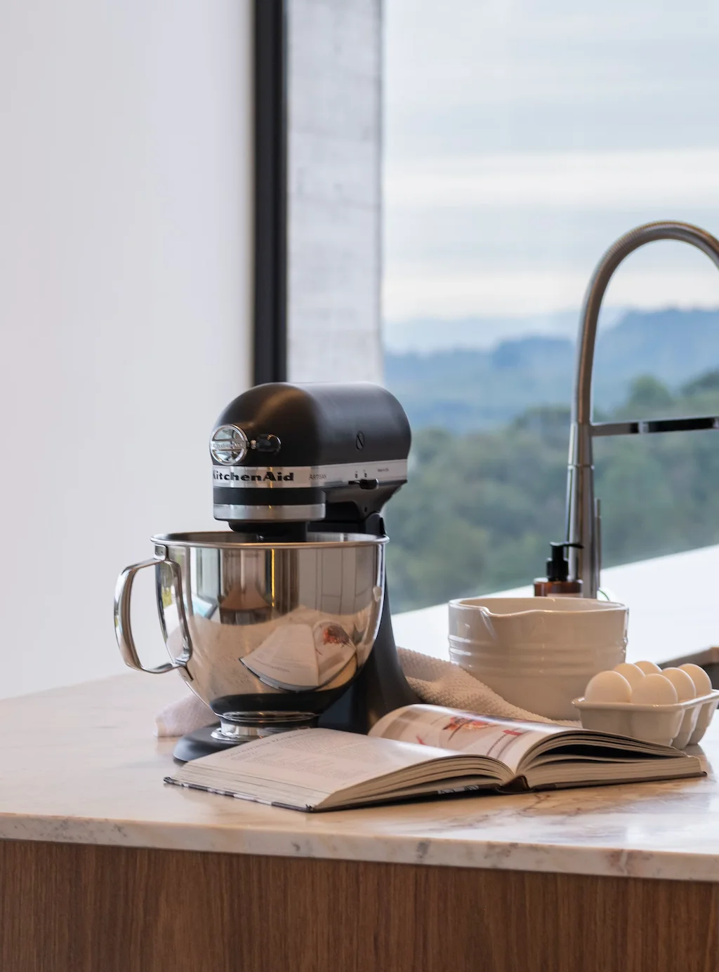
KitchenAid Artisan Stand Mixer
We think the Artisan Stand Mixer is a domestic tool that acts like infrastructure. It isn’t a gadget you try; it’s a platform you commit to. The die-cast body plants itself on the counter, the planetary action mixes cleanly without babysitting, and the front power hub turns one motor into a pasta maker, grain mill, or meat grinder. That ecosystem is the point: one chassis, many techniques, years of use. The KSM150’s tilt-head hits the sweet spot—5-quart capacity for real baking, small enough for tight kitchens, and forgiving for beginners who will grow into it. At about 25 pounds it stays put; no walking across the counter when kneading. The ten-speed control is simple and predictable, and the included flat beater, dough hook, and wire whip cover most tasks out of the box; the rest are a hub away. And yes, the color library matters. This mixer treats the kitchen as a room you live in, not a back room you hide. Plenty of mixers whip cream; the Artisan makes practice stick because it’s capable and permanent, so it earns a standing place in the workflow and on the counter. The lineage goes back to Hobart engineer Herbert Johnston, who brought commercial dough mixing into the home in 1919 under the KitchenAid name. In 1937, industrial designer Egmont Arens drew the Model K—compact, muscular, and efficient—a silhouette that still anchors the brand. After the war, KitchenAid doubled down: metal geartrains for longevity and, by 1955, color options that treated cooking as daily life, not drudgery. The Artisan concept updated that DNA around a versatile 5-quart bowl and approachable tilt-head architecture, delivering professional reliability without the bulk of bowl-lift models. Crucially, the power hub stayed open and backward-compatible, so attachments from different eras still connect. Assembled in Greenville, Ohio, with a long-lived parts ecosystem, it’s designed to be serviced rather than replaced. The KSM150 is the clearest descendant of the Arens idea: industrial mechanics, domesticated for the counter, with an expandable interface that resists planned obsolescence. Few objects say “serious kitchen” faster. It shows up on wedding registries, in cooking shows, and across magazines and feeds because it does two jobs at once: it works hard and looks settled while doing it. The rainbow of finishes turned it into a prop with a purpose, a friendly kind of status—less luxury signaling, more a promise: this household makes things. Its ubiquity is earned by performance. When a mixer can knead stiff dough without walking, accept a new attachment decades later, and shrug off a dusting of flour, it becomes part of the set and the set piece. You see it gifted, inherited, and upgraded, not discarded—older bodies with newer bowls and fresh attachments. The Artisan KSM150 isn’t just familiar; it’s what people buy when they want their kitchen to broadcast craft and continuity.
home-goods
american
stand-mixer
tilt-head
planetary-mixer
die-cast
view Barbour Beaufort waxed jacket
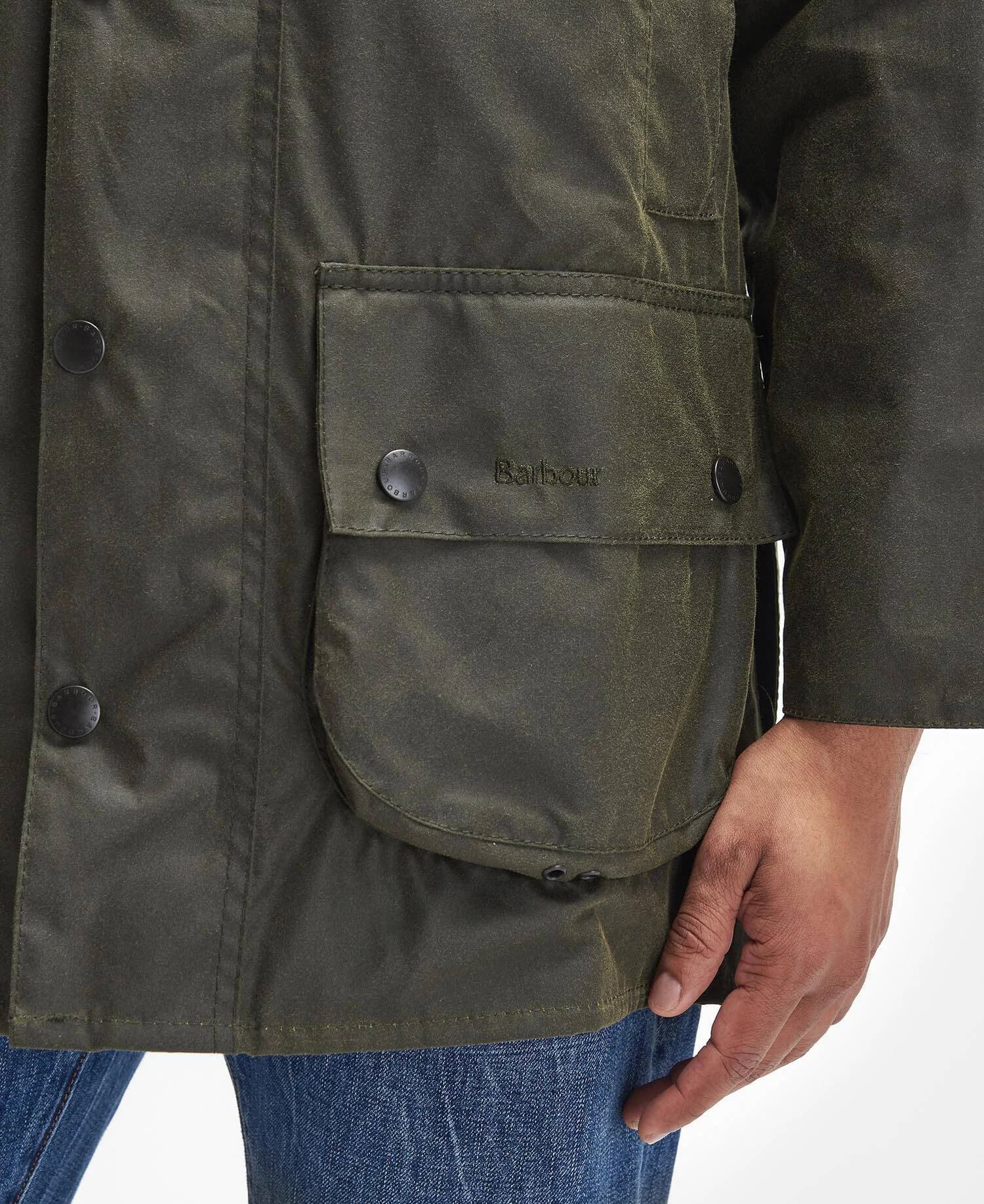
Barbour Beaufort waxed jacket
The Beaufort isn’t just a jacket; it’s a contract with bad weather. We think it’s the benchmark for field-ready outerwear because it solves real problems with quiet confidence: a waxed-cotton shell that sheds rain, a full-width rear game pocket that swallows newspapers or muddy gloves, and pockets placed where your hands expect them. The corduroy collar isn’t affectation—it keeps a cold zip off your jaw and sits softly against the neck. Where many “heritage” pieces play dress-up, the Beaufort earns its keep through function, repairability, and a patina only use can make. Re-wax it, re-stitch it, keep going. Few garments move so easily from moor to metro; throw it over knitwear, a tweed jacket, even a suit. It’s durable without bravado, practical without chatter, and a reminder that the most modern outerwear idea is sometimes the oldest: buy something good and make it last. Barbour outfitted seafarers and motorcyclists long before fashion discovered waxed cotton, but the Beaufort, introduced in 1983 and designed by Dame Margaret Barbour, distilled a century of lessons into one versatile shooting jacket. Where the shorter Bedale was cut for the saddle, the Beaufort was made for hedgerows and towpaths—longer in back, with that signature game pocket and generous bellows pockets up front. The 6oz Sylkoil waxed cotton balances weather resistance with breathability and pliancy, softening with age rather than cracking. Built in South Shields then and now, it pairs Barbour’s tartan lining with a two-way zip, storm fly, and a throat latch that actually works when the wind turns. Crucially, the brand’s rewaxing and repair service make the maintenance culture explicit: this is equipment, not decoration. The Beaufort didn’t chase nostalgia; it set the template. It codified the British field jacket and left countless imitators tracing its seams. We think the Beaufort’s cultural power comes from how unbothered it is by status. Estate keepers wear it. So do editors, students, and royals. Princess Diana’s off-duty looks turned waxed cotton into global shorthand for British ease; the late Queen and King Charles kept it squarely in the national wardrobe. Television uses its outline as instant character sketch: competent, outdoorsy, unflappable. In Japan, magazines and Americana-minded shops treat it as a lesson in patina and proportion. In cities from London to New York, the Beaufort is the rare piece that crosses tribes—preppy, workwear, fashion—without needing reinterpretation or a limited-edition patch. That’s the point: it doesn’t try to be anything but a well-made tool. When culture swings between tech shells and tailored coats, the Beaufort remains the third way—weatherproof, adaptable, quietly sure of itself. It’s the archetype of the waxed field jacket, and wearing one is opting into maintenance, memory, and use.
Coats & Jackets
waxed cotton jacket
British field jacket
Beaufort vs Bedale
rear game pocket
Sylkoil